Some quick Pokémon thoughts
There’s a new trailer out for Pokémon X and Y out right now, and I figured I would write down some initial thoughts while they’re still fresh in my mind:
I’m usually a big advocate for using abstraction. Abstraction is a ridiculously useful tool. While the current trend is that things should be as realistic as possible (I reject this notion,) or that abstraction is usually a cruch for developers to conveniently lean on (It happens, but I mostly disagree with this too,) the fact is that abstraction has very important uses, and not realising this can be a gamble.
In the case of the new Pokémon games, it seems like the right idea to push towards freeflow 3D. Most people have been asking for it for ages (while at the same time shunning the Gamecube games for whatever reason,) but there are a few issues that come up in this change.
First off: There’s a guy riding a grass goat through what looks like the Pokémon equivalent of Paris. In the original games, this is not an issue because the game is abstract by design. All characters and environment are on a grid and look kind of like miniature toys. With everything being abstract, the sight of someone riding on the loch ness monster on the nearby beach looks like a mechanic that matches the grids around it. In the case of X and Y though, it looks… odd. With the more realistic buildings and normal cars darting around, a guy on a goat seems a bit strange.
There are ways to fix this, but ultimately, the game now has to jump through a few hoops to make sense of all this. It’s sort of like that one obscure Korean MMO you feel like you’ve seen before where the cutesy, big headed characters are running next to mushroom houses and kitty faced slimeballs. It can work, but it’s very difficult to do right since you have to justify your abstractions put in a more realistic, 3D setting.
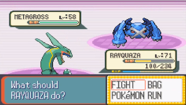
There is also a reason there has never been backgrounds in Pokémon battles until now. The original design was probably created because of limitations (I’ll talk about this in a future post,) but by avoiding the place where these fights occur, the player won’t ask the question “Why are they just standing there? Why isn’t something happening in the background? Why can’t we move around?”
I have a feeling this is one of the reasons Final Fantasy eventually decided to attempt a free-moving battle system, because eventually, it got to the point where just standing still was getting difficult to justify. Again, these things are entirely possible to work in so that things make sense, but you’re looking at a very different method of design in doing so.
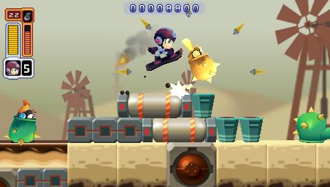
To demonstrate my point: When Capcom wanted to remake Megaman 1 and create Powered Up, they had instructions sent to the team that every character should feel like a collectible toy. While I don’t feel like the design in Powered Up was perfect (there are considerably better examples,) the principle makes sense. You always want things in your world to work within it’s own context, and in a toy-like town, more toy-like things feel natural.
To summarise, I’m ready to see the game in action and like always, I’m hoping to be proven wrong. Also, if you’re making a realistic shooter, it looks weird to equip a dog as armor. Not so much if the world looks like an episode of Adventure Time.


