Simon's blog

The importance of Undertale

July 25th, 2013

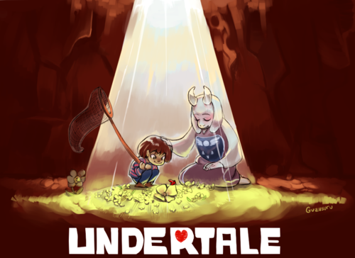
This is going to be a bit of an unusual post. I’ve considered writing this since I tried the demo of Undertale a few weeks ago, and at this point, I’m fairly convinced that Undertale is a considerably more valuable game than most of what’s been announced this year.

as a warning, I will be going through elements that are spoilers from the demo, so if you’re planning on reading this, I absolutely recommend you try out the demo for yourself here before reading this. It doesn’t take long to complete. You’ll have time to do this.

To start off, I think I should mention that I’m a big fan of creative mechanics. More so, mechanics that play into a game’s themes. I feel most recent games that attempt to tell a story have decided to rely on a few set mechanics. The most typical examples have the player character shown in first-person, or in third person. You have buttons for basic attacks or interaction, and other characters are walking around the same world you are, and will respond to said interactions.

Now, whether this is due to the developer enjoying this type of design, or because they feel like they need a template to make it easier to tell their story, this is never the less the most common way of presenting narrative. In fact, I’m sure a lot of you are already wondering if this is even something to object to. It seems to make sense to do things this way, but a number of games have employed vastly different tactics, and I feel it’s a shame this is a design choice we’ve stopped questioning.

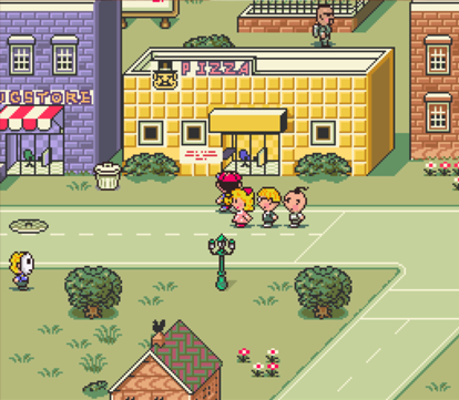
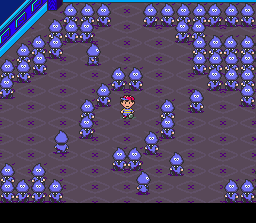
If I am to use quick example, Earthbound for the SNES did something a little different. On the surface, it looks like a standard RPG set in an abstract version of the US, but underneath it all, what made the game special was how they blended it’s themes into everything.

The game is literally an abstraction of the US. Here, you don’t walk up to your enemies and press the punch button. You enter into a turn based system where regular every day objects are given battle effects. You buy a hamburger? You put ketchup on it and it becomes tastier and you heal more. Your enemy is a fan of a pop singer? Throw a magazine at them to distract them. Your enemies are regular people or objects that get angry or are out of control. Normal feelings of comfort granted by a teddy bear is contextualised into providing literal damage protection during the abstract version of a real-life conflict.

A plethora of everyday instances share this bridge. If you want to heal yourself, you can call for a pizza delivery, and like in real life, you have to actually wait for it to arrive. Instead of a standard health bar, in this game it’s themed after a slot machine that slowly ticks down, allowing for lucky numbers and the option to heal yourself before it ticks all the way down.

While the idea of providing an inventive context to normal life is interesting, all these elements are centered around the same premise: What does it feel like to live in the US? What does the KKK living outside your city feel like? How bizarre that must be. Why do Americans put condiments on their fast food? What does riding the bus cross country feel like? To the Japanese developers, they wanted to not only explore, but demonstrate this feeling. But they didn’t do it through long cut scenes or by the statements made by the people in the world. All the mechanics in the game are to some effect a play on American culture. It’s a very simple design strategy and yet it’s rarely explored beyond the game’s theme.

Which brings me to Undertale. -SPOILERS START HERE BY THE WAY-

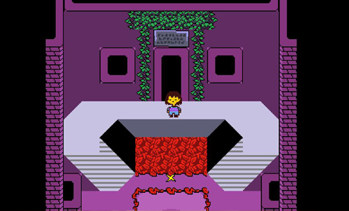
Booting up the demo, I had no expectations from the game. I had simply decided I wanted to try something that day. At the start of the game, you’re placed in a dark pit. The first thing I noticed was that your main character, a child, had no gender traits. Given what the game is centred around, I think it was wise to make the character so that anyone can embody themselves in it. Usually, gender is not an issue for me in games, but in this particular case, I think it was useful as the connection needs to be strong for what is to come later.

The first character you meet seems perfectly innocent. You’re being put through a quick tutorial in the battle system. Then, immediately, you are taught it’s relevance. This character is here to kill you. In fact, you’re told everyone is here to kill you. You are betrayed. As you sit there and wait to die, you’re saved by a large, female character called Toriel, which knocks away your attacker like he’s nothing. She says she’s here to protect you and will help guide you to safety.

Now. I have just been demonstrated that things in this place want and will kill me, even something small and insignificant can achieve this. And suddenly, here is a giant goat lady with visible fangs that can destroy the thing that can kill me easily and says she wants to help me.

“This person is going to betray me too.” And that sets the theme for the entire game.

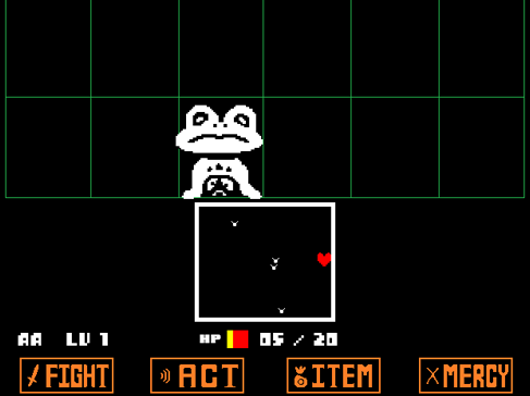
Betrayal and trust will from here on be interwoven with everything. You will be taken into random, turn based battles with enemies as you progress through the game. Following how easily you were attacked the first time, your first instinct is to attack and kill your enemies. To avoid damage, you dodge waves of bullet particles fired at your heart in a contained box. Every enemy has their own themed attack bullet, and most enemies will demonstrate their personality through their attack.

As you progress, you realise that some enemies have problems. Problems you can play into. Some enemies react to flirting. Some don’t like being teased. Some will just spontaneously start dancing and won’t care that you leave the battle altogether. The battle mechanics in other words play on the same theme of trust and betrayal. You gradually learn to know your enemies as characters and what they want. Putting in effort could allow you to avoid fighting altogether. So now, you’re on this dodgy in between place where you could potentially trust things, even if they want to hurt you.

Then there’s Toriel.

At the start, she takes care of you to the point of redundancy. You’re being lead into a room where you have to solve a puzzle, but Toriel solves it for you so you don’t have to. You have a spike pit you need to walk across, but Toriel holds your hand to cross it. She leaves you in a hallway and hides behind a pillar to see if you’re brave enough to walk through a room alone.

The entire sequence paints her a the most caring mother figure possible, and yet, as my instincts tell me, she’s going to betray me. It’s become common in games that the nice character always has a twist at the end and this just means I’m playing to get duped.

I’m left alone for a moment, and end up fighting a ghost boss. Reading into his crying attacks, I cheer him on until he’s happy and leaves me alone. Everything in the first scene is being counteracted, and I’m expecting a twist as a result.

Finally, I get to Toriel’s house. This is where she attacks.

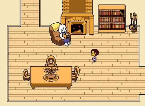
She doesn’t. I’m given a nap. When I wake up there’s cake waiting for me. Toriel is reading by a fireplace. It’s an amazingly well crafted feeling of home and I can’t help but be suckered into the tranquility. Then it happens. I ask if I can go home. Toriel runs off. I knew it.

I follow her to the basement. She’s going to destroy my only exit because if I leave her house, she reasons I’ll just die. Not as bad of a betrayal as I expected, but hey! I was right! This initiates a fight and I have to take her down. There is no option to settle things non-violently. A strange feeling given the options I had before.

That’s when the brilliant happens.

I’m not strong enough to fight her. I’m about to die, and I can’t escape. And through the abstraction the game has based it’s mechanics on, Toriel suddenly visibly moves all her bullets away from me, letting me punch at her while she keeps me safe. The result is I end up killing her. As I leave the room, the same character that betrayed me at the start of the game sits there and laughs at my face as the demo ends.

I need to note a couple of things at this point.

The first is that the game pulled something I didn’t even remotely expect. The good character was actually good. Toriel was presented as a counter to the immediately established theme that in this game, people will betray you. All the mechanics, all your items are centered around this theme. You heal yourself with free candy put out by strangers which could be an easy trick. Your conflicts can or can not be resolved non-violently. Toriel does absolutely everything in her power to help and protect you, and through the same mechanics that demonstrated how you would get betrayed decided to sacrifice her own life in order to keep you safe.

The second point, and one that is a little strange to write about: I was legitimately depressed for three days after playing this demo.

I’ve had a rough time growing up. I won’t claim myself as any special case, far from it, but I’ve had my share of emotional turmoil. I play video games like other people read books, and it’s really been a while since a game legitimately struck me. A lot of games attempt to create characters you care for, but in most cases, it’s a verbal demonstration. You’re told you should like this person and the people in question will state they care about you, but it’s rarely demonstrated, and in games that use generalised mechanics of storytelling, these points are rarely emphasized.

Toriel demonstrated something I feel a lot of us feel we lack. Someone that demonstrates they care about you without a “but” at the end. That feeling safe could actually be justified for once. I feel that’s a very rare quality in a video game.

It should be noted that after I had completed the game, and started researching to write this article, I realised there was a way to resolve the conflict without killing Toriel. It requires a lot of guesswork, but it is actually possible. I don’t feel this detracts from my experience at all. This is not the expected ending, and Toriel has already demonstrated a type of care as a character that is surprisingly unusual.

Most games are about protecting or caring for someone else. Being cared for is an unusual role reversal, and I think provides something we haven’t tapped into yet as game designers.

I feel many games can learn a thing or two from Undertale.
Comment »

Savant the Game: How and Why

July 9th, 2013

So by now, you’ve probably seen the trailer we released for our vacation project. For those of you that haven’t, you can head over to www.savantgame.com ooooooor just watch the trailer right here!

Stayed up for two days to put that trailer together.

As a result of the reveal, we’ve been getting a lot of questions about the game, and I thought I would address some of them here. We’re going to add some of these answers to the Savant Game website when we get closer to release. Now:

Why are you working on this game?

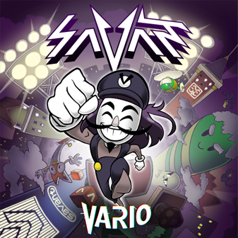
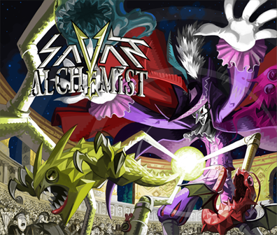
Me and the D-Pad Studio team have known Alex for a while now, long before he chose Savant as his label. We would randomly hang out and work on random projects, one of them being what became Vikings on Trampolines, and a few other things we’ve never shown to the public. I’ve also helped create a lot of his album covers. The first one being Vario, where I tried to create an image for the Savant label, and later I did the cover for Alchemist.


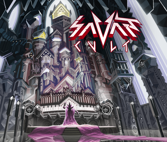
It all really came down to timing. Essentially, we had been working like crazy for who knows how long, and decided we needed a vacation. It just so happened that Alex was working on a new album. I was contacted and I ended up creating the new cover for Cult:

In the process though, we got into discussions about the various projects we had been experimenting on, and we came up with the idea of making an official game out of the Savant label. So in a nutshell, we decided that instead of taking some time to relax, we were going to work even more. I’m sure there’s a mental illness with our name on it, but at the very least we can’t be blamed for being lazy.

So how does this game play?

I suppose the game can best be described as a platform bullet hell. You control the main character by either rolling or jumping between two platforms, each providing a different way to avoid damage. As you kill enemies, you charge up you combo-meter which allows for a stronger burst attack. It’s a very simple game by all means, but then, it was supposed to be.

It’s passed the usual D-Pad quality test, in that Jo tends to forget that he was fixing and ends up playing the game itself. Works like a charm.

How big is this project going to be?

Our goal was to dedicate about a month of development to the title as not to hurt production of our other games. It’s a fun little romp filled with bullets and explosions that we thought people would enjoy, soooo we made it. We could be open do the idea of expanding this game in the future if it seems fun.  Oh, and speaking of our other games…

WHY ARE YOU NOT MAKING OWLBOY?!

We are. There’s a reason we’re very firm on calling this our vacation project because it really is our vacation before we jump back on Owlboy again. In fact, we’ve been working on Owlboy more or less every single day since it’s announcement, and we’re not stopping now.

There’s going to be some very fun Owlboy news on the horizon very shortly, but for now, we’ll let the Savant project have its moment to shine before we reveal what we’ve been tinkering with.

—-

If you have any other questions, just let me know. D-Pad Studio also has a tumblr now over at http://dpadstudio.tumblr.com/ where you can ask questions too.

Once we get closer to the game’s release, I’ll start releasing some of the concept art created for the game.

5 comments »

Savant Tour Poster

June 26th, 2013

Ahoy again everyone!

Just figured I’d show you all a little something I’ve been working on:


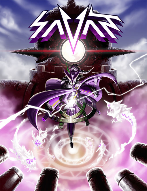
A little while ago I got contacted by Savant; An artist I’ve worked with several times previously. The two more known cases were for the albums Vario: [link] and Alchemist: [link]

This time, he needed a new poster for an upcomming tour, which gave me the chance to do a redesign of the masked character persona, and for those that know me, they know I love to do redesigns. It didn’t take long to decide on this version. For some reason, a slightly more mideaval design with this sort of bizzarre belt-kilt came to mind. The robots I’ll just have to explain later. Point is, it was a lot of fun. It’ll be interesting to see what his fans do with this one.

Enjoy!

Comment »

Some quick Pokémon thoughts

May 15th, 2013

There’s a new trailer out for Pokémon X and Y out right now, and I figured I would write down some initial thoughts while they’re still fresh in my mind:

I’m usually a big advocate for using abstraction. Abstraction is a ridiculously useful tool. While the current trend is that things should be as realistic as possible (I reject this notion,) or that abstraction is usually a cruch for developers to conveniently lean on (It happens, but I mostly disagree with this too,) the fact is that abstraction has very important uses, and not realising this can be a gamble.

In the case of the new Pokémon games, it seems like the right idea to push towards freeflow 3D. Most people have been asking for it for ages (while at the same time shunning the Gamecube games for whatever reason,) but there are a few issues that come up in this change.

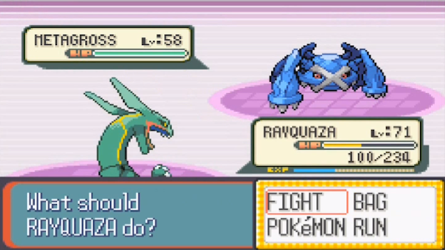
First off: There’s a guy riding a grass goat through what looks like the Pokémon equivalent of Paris. In the original games, this  is not an issue because the game is abstract by design. All characters and environment are on a grid and look kind of like miniature toys. With everything being abstract, the sight of someone riding on the loch ness monster on the nearby beach looks like a mechanic that matches the grids around it. In the case of X and Y though, it looks… odd. With the more realistic buildings and normal cars darting around, a guy on a goat seems a bit strange.

There are ways to fix this, but ultimately, the game now has to jump through a few hoops to make sense of all this. It’s sort of like that one obscure Korean MMO you feel like you’ve seen before where the cutesy, big headed characters are running next to mushroom houses and kitty faced slimeballs. It can work, but it’s very difficult to do right since you have to justify your abstractions put in a more realistic, 3D setting.

There is also a reason there has never been backgrounds in Pokémon battles until now. The original design was probably created because of limitations (I’ll talk about this in a future post,) but by avoiding the place where these fights occur, the player won’t ask the question “Why are they just standing there? Why isn’t something happening in the background? Why can’t we move around?”

I have a feeling this is one of the reasons Final Fantasy eventually decided to attempt a free-moving battle system, because eventually, it got to the point where just standing still was getting difficult to justify. Again, these things are entirely possible to work in so that things make sense, but you’re looking at a very different method of design in doing so.

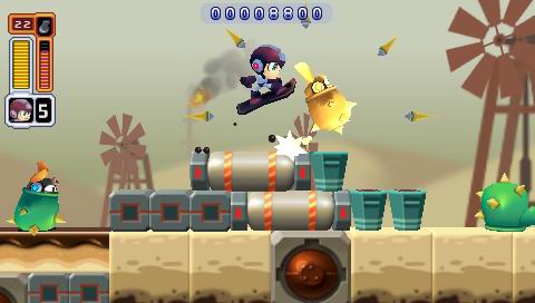
To demonstrate my point: When Capcom wanted to remake Megaman 1 and create Powered Up, they had instructions sent to the team that every character should feel like a collectible toy. While I don’t feel like the design in Powered Up was perfect (there are considerably better examples,) the principle makes sense. You always want things in your world to work within it’s own context, and in a toy-like town, more toy-like things feel natural.

To summarise, I’m ready to see the game in action and like always, I’m hoping to be proven wrong. Also, if you’re making a realistic shooter, it looks weird to equip a dog as armor. Not so much if the world looks like an episode of Adventure Time.


3 comments »

Past links to definition

April 29th, 2013

This is just a little comment to expand on a point I’ve made elsewhere.

It’s no secret that I love the Zelda series. This includes all the newest games, all of which have been an artistic inspiration to be for years. Like most people, I was excited when Nintendo announced their plans to create a sequel to A Link to the Past for the 3Ds. While I don’t feel like the game needed a sequel, the alternative was a remake, and I’m much more in favour of sequels. It doesn’t spoil the original game much and can introduce some new thinking and ideas.

However, I was a little sure how I felt about the art side of the game. I’ve commented on this, but it’s often difficult to illustrate a point properly, so I’m going to show what I mean here:

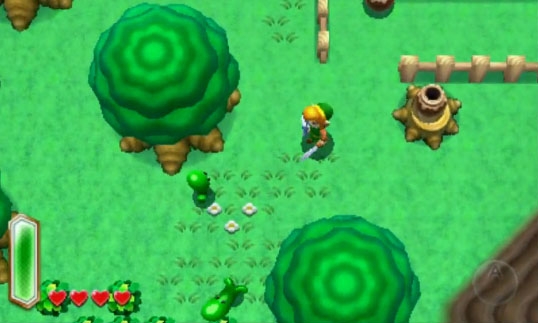
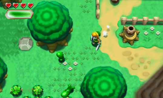
Here’s a good example of the issues I’ve been trying to address. There is nothing inherently wrong with the art here, aside from maybe lacking a bit of imagination. It’s picked a more blue saturated palette than the original game which relied a lot on browns and greens, but it’s used mostly the same designs. I can also appreciate these kinds of colors (See Minish Cap for an excellent way of doing this,) so it doesn’t bother me.

My complaint was about definition. The screenshots and videos shown so far are very lacking in contrast and everything generally feels very flat. I’ve heard the argument that the 3D features make up for this, and watching the 3DS video on the system makes shapes clearer, but I feel that doesn’t make it any less valid to add artistic choices that makes the game better in addition to the 3D.

In this screenshot, the models are fairly flat, the shadows are weak and the ground lacks variation in both color and design to break up the grid feel.

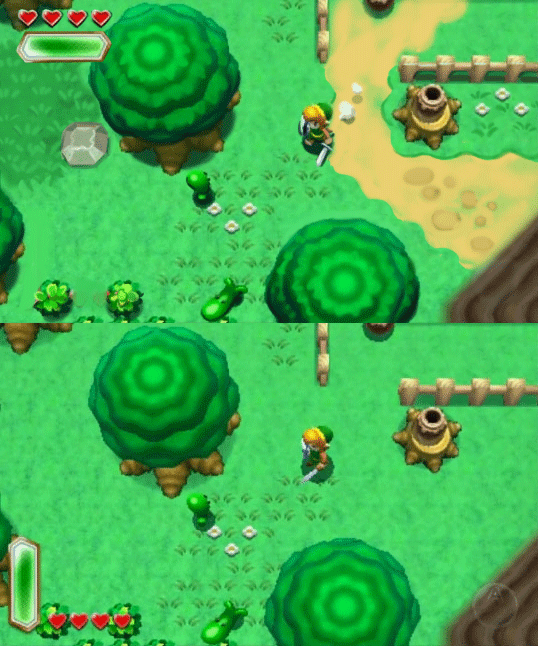
To illustrate my point, here’s the same screenshot, but edited to create proper depth and contrast:

Very minor changes here. All shadows are now darker and more defined to give volume. Enemies, characters and objects that need to  pop out against the ground and show depth have a subtle, darker rim around the bottom edge to show them better. This is a common technique pixel artists use called a sub-outline. Some 3D models achieve this effect by just having harder shadows.

I’ve added more variation into the scenery to break up the monotonous feel, adding a dirt path, darker grass patches and rocks from the previous game. This also brings in more colors, while still using the same palette that’s already native to the scene.

Link’s pose is also doesn’t have everything pointed forward. His face is more visible (a huge part of having caricatured sprites in the first place) and some particle effects to make the motions more fun to look at.

Finally, I just moved the HUD because I simply like that look better. Removed the A button mark for good measure because I can.

I’m not making the claim this is how it should be done, simply how I would have tweaked things. But Nintendo is free to give me the licence and make amazing things with it if they want. I’m game.

To summarize:

Definition is good, and I like to nitpick.

2 comments »