By now, I’m sure most of you have heard the announcement for a remake of the NES game Ducktales. In case you haven’t, this should bring you up to speed:
At the time this was announced I was knee deep in business meetings and randomly came across the news flipping through articles during a coffee break (I have a huge thing for coffee…)
By the looks of it, it seems like Wayforward has done an excellent job paying homage to the original game, but also the show that spawned it. I was surprised to see that they’ve added cut scenes with voice acting to it. While I used to watch the show in Norwegian as a kid (it was called ‘Adventures with Huey Dewey and Louie’ simply because that’s what made the theme song work,) I still recognise the voices for the American version. If they haven’t got all the original voice actors back to dub the game, they do a marvelous impression. Surprisingly the cut scenes don’t seem to bother me much. Making changes to a game can often feel grating, but as it stands I think it adds a nice bit of flavour, given that it doesn’t get overdone.
All that aside, it’s the project itself that intrigues me. Not just because it’s a remake of a game I grew up with, but because I was involved in its infancy.
In 2010 me and D-Pad Studio were nominated for an IGF award in Visual Excellence, and ended up chatting with a number of different people. We were approached by someone in need of artists, and told us his plan to pitch a number of remakes to Capcom. One of them being Ducktales on the NES.
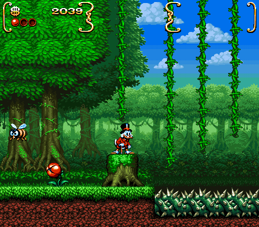
We started talking and before long I was piecing together a mockup to use for this pitch. My idea was to start out with a redo of an old NES screenshot, bumping up the resolution to a 16-bit look to keep it somewhat nostalgic, but try to maintain the same color palette.
This is what I came up with:
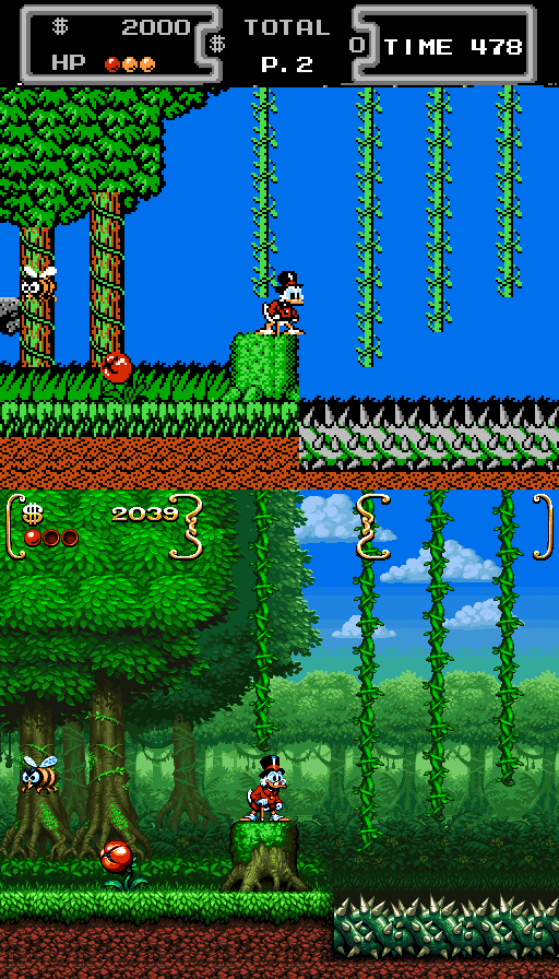
Not my greatest work, but it got the idea across. The mockup was a redo of the Amazon stage in the first game with a slightly more functioning HUD. My plan was to highlight the option that you could do a co-op/competitive segment with Flintheart Glomgold. With the HUD smaller, yet keeping the two box design from the previous games, there was space for another player to join in. The mockup is kind of a mess looking at it now. I tried making the Amazon look more like an actual jungle while still keeping the tiles clearly visible, but when it came down to it,the thing was too rushed on my end and elements ended up being too flat or inconsistent. I did really enjoy the idea of trying to keep the high-contrast colors of the original game. you can see the comparison here:
If I were to do this again today, I would have made sure there was proper contrast between foreground and background, and given the ground tiles some proper character. For that matter, create assets that felt more in line with the originals feel. Still, it was fun to work at.
Obviously, since I’m showing you all this, no one picked this up. I’m assuming the idea was passed on around Capcom’s offices and eventually ended up with Wayforward. I was pretty convinced it wouldn’t happen given that the show was over and Disney might not wish to stir up attention for a cartoon they didn’t have plans to bring back. I’m glad I was proven wrong though.
It’s going to be interesting to see what’s going to happen to the game. The vision is different than mine, but then that’s probably a good thing. The 2.5D aesthetics actually seem to work nicely. I’ve noticed that they’ve made the more random Beagle Boy encounters into more of an event, which is probably a smart decision considering how quickly you could do away with them in the original. The fact that they’re adding in the money bin as a stage looks really exciting too. Of course, from my end, I’m really looking forward to their version of the Amazon, and seeing how it contrasts to mine.
Guess I’ll just have to wait for now. That, and listen to more moon remixes.


They really did get the entire surviving voice cast, including the 90+ years actors for Scrooge and Magica de Spell!
This looks absolutely gorgeous! How I wish you were in charge of visual design for this remake! A lot of people (including me) actually find the 2.5 very cheap looking.
Wow, yours looks 10000x better than theirs. Would’ve actually day1buy’d it if it looked like yours. As ugly as theirs is looking right now Im unsure if I’ll ever buy it.
That looks gorgeous! I’m actually really, really interested to hear more details about what you didn’t like about your version. As best as I can tell, it looks pretty great!
Reminds me alot of The magical quest starring Mickey mouse which absolutely great!
Wayforwards are very good chaps and every time I’ve worked there I’ve loved it, I also think it’s amazing that they did the voiceactor thing and I am not against the 2.5D decision.
Still, I think this implementation looks wrong, the dynamic lighting doesnt always create the right colors for 2.5D and makes the art look like cutouts, I cant say I’m a fan of the obvious puppet animation either :p
Dragon Quest Priney game and Ghosts ‘n Goblins ultimate are good examples well done 2.5D that Wayforward could have applied, but the specific implementation of Ducktales undermines the 2D art and irks my suspension of disbelief
SEO…
Thank you for your article post.Really looking forward to read more. Really Cool….