This is just a little comment to expand on a point I’ve made elsewhere.
It’s no secret that I love the Zelda series. This includes all the newest games, all of which have been an artistic inspiration to be for years. Like most people, I was excited when Nintendo announced their plans to create a sequel to A Link to the Past for the 3Ds. While I don’t feel like the game needed a sequel, the alternative was a remake, and I’m much more in favour of sequels. It doesn’t spoil the original game much and can introduce some new thinking and ideas.
However, I was a little sure how I felt about the art side of the game. I’ve commented on this, but it’s often difficult to illustrate a point properly, so I’m going to show what I mean here:
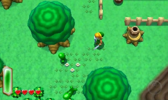
Here’s a good example of the issues I’ve been trying to address. There is nothing inherently wrong with the art here, aside from maybe lacking a bit of imagination. It’s picked a more blue saturated palette than the original game which relied a lot on browns and greens, but it’s used mostly the same designs. I can also appreciate these kinds of colors (See Minish Cap for an excellent way of doing this,) so it doesn’t bother me.
My complaint was about definition. The screenshots and videos shown so far are very lacking in contrast and everything generally feels very flat. I’ve heard the argument that the 3D features make up for this, and watching the 3DS video on the system makes shapes clearer, but I feel that doesn’t make it any less valid to add artistic choices that makes the game better in addition to the 3D.
In this screenshot, the models are fairly flat, the shadows are weak and the ground lacks variation in both color and design to break up the grid feel.
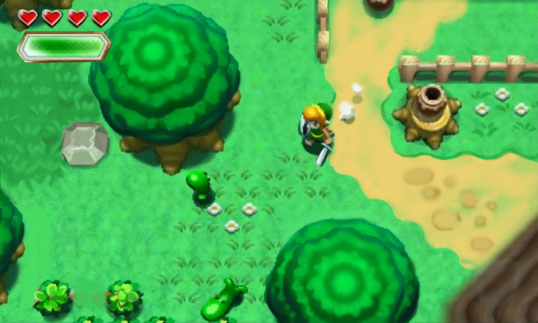
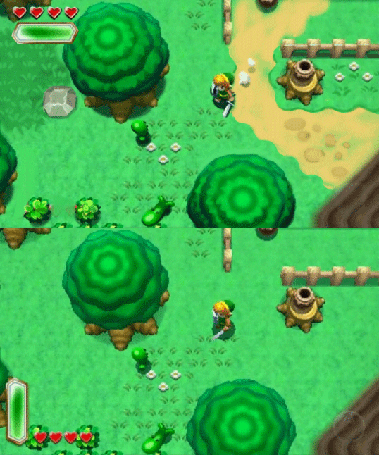
To illustrate my point, here’s the same screenshot, but edited to create proper depth and contrast:
Very minor changes here. All shadows are now darker and more defined to give volume. Enemies, characters and objects that need to pop out against the ground and show depth have a subtle, darker rim around the bottom edge to show them better. This is a common technique pixel artists use called a sub-outline. Some 3D models achieve this effect by just having harder shadows.
I’ve added more variation into the scenery to break up the monotonous feel, adding a dirt path, darker grass patches and rocks from the previous game. This also brings in more colors, while still using the same palette that’s already native to the scene.
Link’s pose is also doesn’t have everything pointed forward. His face is more visible (a huge part of having caricatured sprites in the first place) and some particle effects to make the motions more fun to look at.
Finally, I just moved the HUD because I simply like that look better. Removed the A button mark for good measure because I can.
I’m not making the claim this is how it should be done, simply how I would have tweaked things. But Nintendo is free to give me the licence and make amazing things with it if they want. I’m game.
To summarize:
Definition is good, and I like to nitpick.


Beautiful edit! I was surprised that you didn’t do anything to make the pot on the stump pop out more. I feel like I’d have ran right past it if I were playing.
I have to agree about the contrast not being high enough. I think if Nintendo makes the very small tweaks you just displayed I feel the game will have an overall better feel and look to it. I always do a test by squinting my eyes and if I can’t tell different objects apart from each other there isn’t enough contrast. That’s the easiest way that I know how to test for lack of contrast. Works every time for me.