UnderTale analysis, part 2
A very common feature of especially western games is to try for some kind of photorealism in art style. Where this is deemed inappropriate, such as for games that need to appeal to a wider age group, cartoony graphics are often adopted. However, for games that try to communicate complex themes, cartoony graphics are not common. The choice can be justified by analogy – we wouldn’t choose cartoons over live-action movies to tell our most complex film stories. However, I hope to show that UnderTale benefits greatly from choosing cartoony graphics in telling its story.
Art style and comedy in characterization
To illustrate this point, I want to take some time to compare two games that both fascinated me: Radiant Historia and Phoenix Wright. Radiant Historia in particular got me thinking about this topic because of the somewhat extraordinary portrait art for the main character, Stocke.
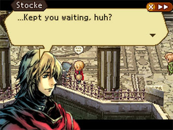
Stocke only has one portrait that is used for every situation in the game. Accordingly, the portrait seems highly ambiguous as to what state of mind Stocke looks to be in. He might be sad, he might be laughing sarcastically, he might be thoughtful or worried. The portrait, in fact, seems to encompass most of the emotions that Stocke displays at all throughout the course of the game.
I was fascinated by this. The question struck me, why not just create a few portraits, each with their own facial expression? This might, of course, be because of technical limitations, but I favour a different explanation. They simply wanted detailed portraits, and when you make detailed portraits, redrawing them from a different angle can lose much of the detail that you’re used to seeing in that character’s art.
Look at how Stocke appears on this cover art for the game, for instance:
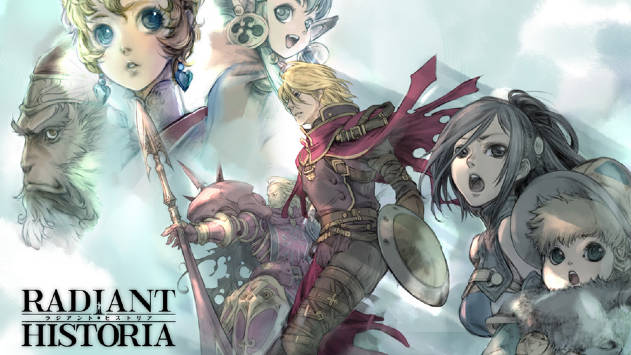
I scarcely recognised him (additionally, I didn’t realize who Raynie was until I thought she was missing). This might not be readily apparent to you if you haven’t played the game, but to me, the Stocke on the cover art has different hair, a stronger chin, different eyes, and a different cloak. For a character like Stocke, who doesn’t have any particular defining facial features (he is a blond man, and that’s mostly it), redrawing him simply serves to make it unclear what he looks like.
The other issue is that if you draw a set of realistic, non-comedic expressions, the effect isn’t necessarily very profound – all you have done is to remove some ambiguity as to what the character is feeling, ambiguity which the player might prefer that you left untouched. So we get less instantly recognizable characters at the expense of effort, ambiguity, and potentially detail. Radiant Historia decided to favour the ambiguity. In exchange, you’re often able to tell a character’s personality instantly from seeing their portrait in Radiant Historia.
Phoenix Wright: When emotions need to be shown
Phoenix Wright is a game where reading other characters’ mindsets is very important. It’s a game where you play as a lawyer, but your role is more that of a detective. Furthermore, since the game is intensely character-focused, your progress is shown through the villains visually breaking down in front of you as you defeat them in the courtroom and show their true colours. It’s extremely important that you are able to make characters that the player loves or hates, and it’s important that you are able to represent ambiguity.
The game is a comedy.
Isn’t that odd? A game with such high goals for characterization and that really wants its characters to be interpretable and well-characterized is a comedy. We wouldn’t see that in, say, Hollywood. If you wanted a courtroom drama, you would do that as a courtroom drama. Doing it in a cartoony style seems unthinkable. You’d want well-rounded, believable characters with realistic, complex motivations.
Phoenix Wright doesn’t eschew complex motivations or well-rounded characters. However, its starting blocks are nearly always highly caricatured, comical designs. Here are some examples.


These characters are, admittedly some of the more comical characters in the game – however, even the more realistic characters have comical or cartoonish mannerisms:



So why does Phoenix Wright work so well? It’s not primarily known for being funny. There are, of course, elements from the game that have entered into popular culture, such as the iconic “Objection!” – but I have yet to meet anyone who thinks of Phoenix Wright as primarily enjoyable for its jokes and laughs.
No, the thing that sets Phoenix Wright apart, at least in my view, is that it uses comedy and caricature to create a diverse roster of fun, enjoyable characters that you can sympathise with because the creators are not afraid of showing the details about them that are over the top, silly, or embarrassing.
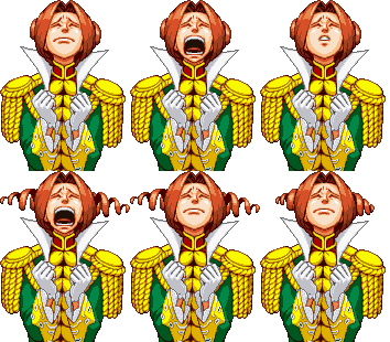
But more to the point, the comical, caricatured art style is highly convenient when you want to make expressive animations because you don’t have to hold back when trying to express the character. If you want a character who is obsessed with his own wealth, you can literally have him flash his diamonds with the world’s smuggest smile. If you want the pink magician with the silly hairdo to seem scared and helpless, you can literally have him curl into a half-foetal position with mascara running down his cheeks.
This is the change that comes upon him:


With animations this expressive, we are no longer making “the magician when calm” and “the magician when scared”. We are making animations so expressive that the character himself is defined by how he acts in them. The magician Billy Bob John (as is his name), in our minds, is that guy who breaks down and cries, and who is really cocky on the surface. He also wears mascara, flamboyant clothing, has pink hair, and is a ladies’ man. You can tell most of this from the portrait, and it feeds into the characterization of him in a big way. We only really need to see these two portraits, along with some accompanying dialogue, to feel like we know him – even if we don’t necessarily like him.
Lastly, another advantage of this art style is that the way two different characters express the same emotion will rarely ever be the same. The designers can go out of their way to find a new niche for every new character’s animations, which helps keep every situation and character unique and fresh. If you had to attain realism, then it would be difficult – how many ways can people really smile in, realistically?
This is just another reason why Phoenix Wright benefits so greatly from showing emotions in their characters, and Radiant Historia does not.
Back to UnderTale
This relates to UnderTale in one key way: UnderTale is also not afraid of throwing aside realism in the service of characterization. The first enemy that you meet in the game is a flower with a smile on its face. The design looks like it’s taken out of a childrens’ book. I would claim that it’s impossible not to have this association.
When the flower then tries to kill us, it changes expressions:

These expressions go far, far beyond what you could do in a realistic setting. These quite simply is no way for a human being to do that with its face. Instead, we cannot quite decide if this is just the extent of the flower’s satisfaction at being able to kill us, or if this is simply what the flower truly looks like when it’s not hiding its true appearance.
Either way, it adds greatly to the effectiveness of the scene.
Perhaps more subtle is the way in which the fact that Toriel is not an ordinary human character is useful to the storytelling.
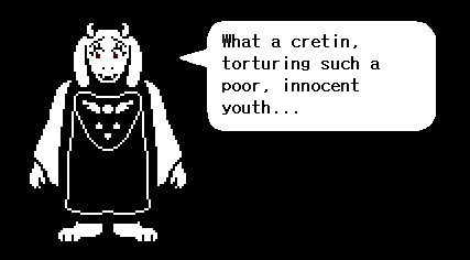
Toriel is meant to represent a maternal figure who we are supposed to not know whether we can trust, as we established in the previous part of this series. How does her design help with that? I can think of several ways.
- She has feminine eyelashes and long ears, making her look like a woman with long hair. Her eyes are larger than a normal human being can have, which makes it very apparent when she is happy or concerned.
- She is large, much larger than you, and makes you look like a toddler by comparison – this can be done without implying that the main character is a toddler, because Toriel could just be larger than humans are. This also makes for effective imagery, especially when she holds you by the hand.
However, the most important detail, as I see it, is this: Toriel is not human. Just like the flower, and unlike the main character, Toriel is one of the monsters of the underground, and it was established early on that these are different from humans. This is extremely important for creating the feeling of distrust towards Toriel. She is in a different group than us, and it’s never even explicitly stated. We simply see her, and know that there is something about her that we cannot trust.
Noise?
As a thought experiment in seeing how important these differences are, try to picture UnderTale happening with people instead of monsters, and with a realistic art style. You meet a person who turns out to want to kill you during the tutorial, and you run into a different person who saves you, and then tells you she’ll take care of you. A good story is still good (and UnderTale’s story is good), but so many advantages fall away.
Not to mention that you get new possible interpretations that add noise to the otherwise elegant and sufficiently complex themes – to recreate the original UnderTale’s divide between humans and monsters, one might be tempted, for instance, to make a racial divide – which would bring a whole host of new connotations.
Of course, in some cases you want the extra “noise” as I call it. After all, it’s just extra complexity. However, in games it’s usually trivial to add more complexity. Our worlds can be infinitely large, we can have infinitely many characters, and our gameplay mechanics in themselves can be extremely bewildering. The difficulty for games’ narratives, in my experience, is to create at least one clean narrative thread that we can follow effortlessly and be deeply engaged in.
I won’t investigate whether I am right in this view – perhaps I will do that some other time. Nonetheless, I hope that this has elucidated some of the strengths of comedy and unrealistic art styles.

